Whether it's on the west coast, east coast, or right here in Lansing, Michigan…a website is accessible to visitors across the globe. The design of a website should greet visitors in a warm and welcoming matter, functioning to serve their needs and provide them with the information they came to find.
Although the content differs across any and all websites depending on the organization, there is one element that is (usually) featured on every page: a company logo. (If the logo isn’t on the website, we have a bigger problem).
A logo is a single piece of a company’s branding strategy. It acts almost like a small, 24/7 advertisement reminding people, “hey, this was made by us” or, “this is offered by us.” Ask yourself: what does the logo say about the company? Even more so, how is it influencing the website design?
The color of the logo can be just as powerful as the design itself. Imagine Apple with a black logo, or Coca Cola with blue letters…would these two brands be what they are today without that component?
Let’s start with Apple.

In advertising, the color white denotes cleanliness and innovation. The “color wheel pro” also suggests it symbolizes simplicity in high-tech products. See the connection? Take a look at Apple’s homepage. A few words that might come to mind right off the bat are clean, organized, and minimalistic. Their logo is placed in the upper left-hand corner, in line with the horizontal navigation bar. The first thing you might notice is the size of Apple's logo - present yet miniscule, denoting a lack of emphasis in comparison to other graphics on the page.
Why is this? Apple is a business-to-consumer company, and consumers are already well-informed as Apple is ranked the most valuable brand in the world. Notice the icon is also standing alone, it doesn't need the word 'Apple' for consumers to recognize it. Most companies don't have this headway as their brands are less distinguishable.
When you scroll over the apple a light gray overlay appears, setting it apart from the opposing navigation options. Each page on the website features a white background, large black type and even larger graphics. (Keep in mind black and white provide the strongest color contrast.) The large size puts emphasis on the photos so that viewers’ eyes go straight to the product being featured.
Additionally, the type which contrasts with the background, allows for easy and clear readability. Apple makes use of multiple different heading sizes: a page heading, a subhead, a product title and a product description. Links are placed in the same size as the product description, so that visitors have the option to explore more information. This clean-cut style used to design the website supports and enhances the company’s mission of providing innovative hardware and software to students, educators, creative professionals and consumers worldwide.
Now let’s take a look at Coca Cola’s logo.

Red is a very intense color, associated with energy, passion and desire. It also stimulates people, motivating them to make decisions quicker than usual. Coca Cola’s website features a strong dose of red, however not to the extent it overwhelms the viewer. Similar to Apple’s chosen format, the logo can be found in the upper left-hand corner, also in line with a horizontal navigation bar. The Coca-Cola Company is similar to Apple for the fact it is also a well-known business-to-consumer brand. For this reason, Coca-Cola's logo also has a low impact on the site.
The red strip that runs across the top draws attention to the logo and navigation, while the slider box incorporates a more subtle, yet still eye-catching gradient of reds. Similar shades are integrated in the lower three modules. As the eye runs down the page we find another horizontal navigation bar, enhanced by a bright red strip that runs along the lower most module of the page. Navigation titles are shown in white type, with a bright yellow overlay appearing with the scroll of the mouse for added contrast.
The next example we'll look at is different than Apple and The Coca-Cola Company, as it is a business-to-business company.


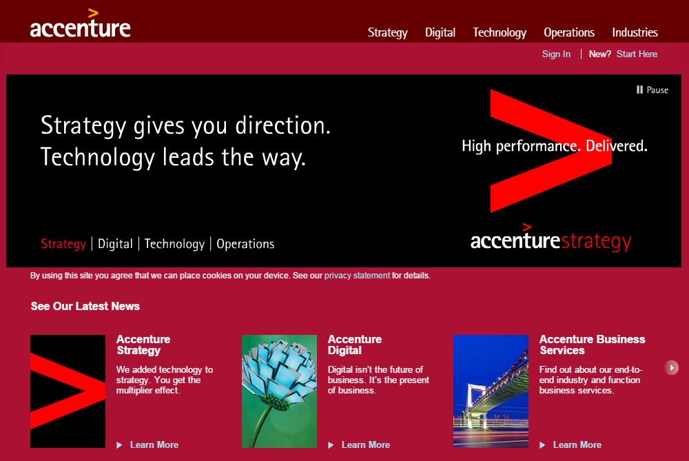
Accenture is a company that specializes in consulting, technology services and outsourcing. Although the company is much larger than both Apple and Coca-Cola, its presence is not as well-known among consumers. For this reason, Accenture's logo has a larger impact on the company's website design.
The logo takes up a larger space in the upper left-hand corner. It is actually incorporated into the design, present in the slider box and modules. Notice Accenture includes an angle bracket atop the name of the company; the bracket itself occupies a large amount of space on the home page. However, because the company is not well-known, the angle bracket must always be used in conjunction with the actual word 'accenture.' The company probably would not use the stand-alone bracket anywhere other than the website, simply for the fact few outside the business consulting and technology community would recognize it.
The logo should set the tone for the design of a website, and even though some influence website design more than others, both the logo and site are critical aspects of a brand. Most companies won't be able to get away with using an icon, or portion of their logo by itself. Utilize the elements of the logo and design a site that highlights interaction between the two.
Designing a website that works in collaboration with the company’s logo increases the effectiveness of the branding strategy as a whole, helping visitors recognize and understand a company's goals. Upon starting the next web design project, keep in mind these three successful, yet different examples of how logos are a highly influential element in the overall design of a website.
Topics: creative


