
Well designed websites for businesses are built with the customer in mind. When you visit a website, you don’t have all the time in the world; you’re looking to find the information you need in a reasonable amount of time. Best-case scenario? The page is formatted so that the most important information is near the top; if you want to scroll and read more, you can. A great website should be functional, visually appealing, and communicate targeted content.
A few of the things that make a website appealing to customers are navigation, images, reviews, blogs, and security. Navigation helps you find information quickly and easily. Images appeal to those with more visual capacities while reviews and blogs provide helpful information. Security features let your visitors know their information is protected.
Before we take a look at some examples of well designed websites, let’s define some key terms. Each feature below enhances the customer experience:
- Accordion menu: a user-friendly, custom menu in which items slide down to reveal sub menus
- Call-to-action (CTA): an instruction to the visitor with the intent of achieving an immediate response
- Facet filtering: a feature that lets visitors search with a keyword and scan a list of results
- Mega menu: a dropdown menu in which all options are displayed in categories
- Parallax: a scrolling technique used to enhance page depth and animation
- Responsive design: an approach to web design where the viewing area snaps to fit any screen size
A couple more key terms to know include:
- Drupal: an open source software maintained and developed by a community of over one million users and developers; anyone is free to download and share it with others
- E-commerce: short for electronic commerce, a term for any type of business or commercial transaction that involves the transfer of information across the Internet
- Slider: a module that slides images horizontally or vertically (usually horizontally)
Here are a few examples of sites chosen by our web developer:
Asahi Kasei Plastics 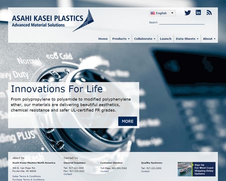 Asahi Kasei manufactures high performance plastics for original equipment manufacturers (manufacturers who resell another company’s product using their own name and branding) and their suppliers worldwide. Asahi Kasei's customers turn their plastic pellets into materials that can be found all around you—in your home, when you’re traveling, and in your workplace.
The Asahi Kasei Plastics website acts as a tool to showcase the products customers have made using their plastic pellets. You can easily browse solutions, segments, and materials with a single click of the mouse.
This website was built with Drupal CMS and features a background slider. The website is responsive, automatically adjusting to fit any screen size. The site also features a custom mega menu, a drop down interface that reacts when a user hovers their mouse over the navigation bar. Navigation is broken down into many tiers to ensure that reaching requested information only takes a couple clicks. The homepage features a large call-to-action. On top of all of these features, the site is also multilingual, offering content to visitors all over the world.
Dewpoint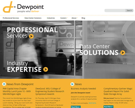 Dewpoint is a leading systems integrator and technology consulting firm. They offer professional services such as portfolio, program, and project management services, strategic IT assessment services, infrastructure-managed services, and application development and maintenance. Data center solutions include infrastructure optimization, database solutions, data protection and archive solutions, data storage solutions, enterprise security optimization, identity management, and data center support.
Dewpoint’s website was also built using Drupal. Three unique calls-to-action can be found on the homepage, along with an accordion side menu. A testimonial section that randomizes every 12 hours is located in the bottom right-hand corner. The site features amazing responsiveness, optimizing the viewer experience on a wide range of devices.
Patagonia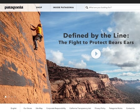 Patagonia designs outdoor clothing and gear for sports such as climbing, surfing, skiing, and trail running. The company aims to “build the best product, cause no unnecessary harm” and “use business to inspire and implement solutions to the environmental crisis.”
Patagonia’s site is an incredible example of an e-commerce website. While the site holds an array of content, it is very clean and simple to navigate with an easy-to-use mega menu featured at the top of the page. To optimize the interaction experience for visitors, the website includes a color-changing grid for product browsing and facet filtering. Additionally, Patagonia includes a clean and professional reviews section. The website is fully responsive with Bootstrap 3 CSS framework, which is the most popular framework for developing responsive, mobile projects on the web.
Boldking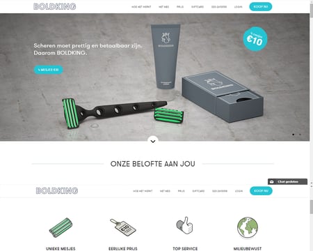 Boldking delivers razor blades to your doorstep depending on your chosen program and preferences. They believe shaving should be enjoyable and affordable, promising customers unique blades, fair pricing, top-notch service, and environmentally friendly packaging.
This website features parallax scrolling with an added animated effect to explain how each program works, features, and what you get. Boldking.com is also responsive with lower animation on smaller screen sizes to enhance the viewing experience. Upon clicking on the “Gift Card” link in the top navigation menu, users are directed to a five-step accordion walk-through.
These are just a few examples of websites that feature well-executed implementations. You may not recognize the type of menu or responsiveness upon first glance, but these features are built into the framework and enhance your overall viewing experience. The sites were designed with the user in mind. Each of the above sites is responsive, functional, easy-to-use, and marketing-driven.
Topics: Web
