
While you shouldn’t do something just because it’s popular, utilizing the latest design trends can be a great way to capture the attention of your audience in order to share your story and solve their problems.
From sleek and simple to breaking out of the box, the design trends we’re watching are all about telling stories in authentic and bold ways.
Here are a few graphic design trends that you should keep an eye on, along with a few classic principles that we don’t think are going anywhere.
Breaking Patterns
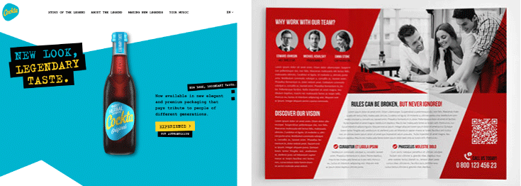
Literally designing outside the box is becoming more popular as websites try to find a way to stand out. De-familiarized and asymmetric patterns are expected to become the norm rather than the exception.
Before now, the layouts of websites were generally uniform with some variations. Menus sat in one box, images in another and web pages typically created a grid of design items. Today, designers are breaking old patterns and embracing innovation and creativity in webpage design.
We will start to see more scattered grids and asymmetrically styled layouts. This can be visually creative and unexpected but be careful...you still want visitors to be able to find what they’re looking for! Don’t get so creative that potential customers can’t find your product page or figure out where to click to contact you.
Gradients and Duotones
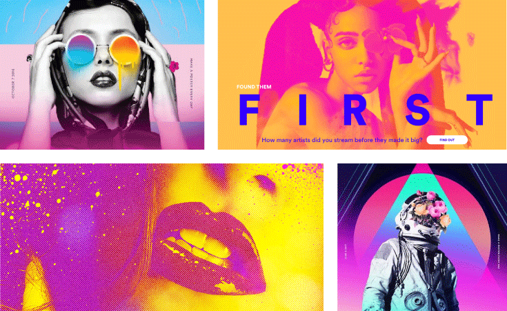
Gradients, or the subtle increase or decrease from one color into another, are not new. Gradients are a trend that has emerged gradually (funny, right?) over the years, which means using them in design is something you can expect to see stick around.
Combined with duotones, embracing the use of two different colors in a design, gradients can add depth to a design project. Duotones are replacing the use of whites and blacks in visuals and can create a colorful and futuristic feel.
Fonts with Personality
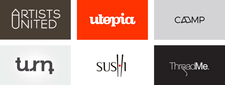
Remember when the only way to get crazy with fonts was in WordArt? Or carefully selecting Papyrus or Comic Sans for your school report and thinking your writing would have personality? No more. Fonts don’t take a backseat to design; they can be the design. Fonts are used as a critical way to convey brand and message in a way that resonates with your target audience.
We used to just have the fonts that came with a computer – today we have access to thousands upon thousands of fonts with services like dafont.com that allow users to upload fonts that they’ve created and share them with the world. Even professional web safe fonts continue to expand with a robust catalog from open sources like Google Fonts. Fonts are no longer limited to boring and overused – you don’t have to look like everyone else! - so don’t just use your fonts to support the design of your page, think bigger. Be bold and use fonts to capture your audience’s attention. Create the aesthetic that represents your brand.
THREE-DIMENSIONAL
Don’t worry, you won’t need glasses to enjoy the three-dimensional design trends of the future.
3D design has established itself as an ongoing design trend that keeps evolving and growing and isn’t going anywhere over the next few years. With technology quickly advancing, it's now easy to render fonts and other design elements in 3D and create stunning compositions.
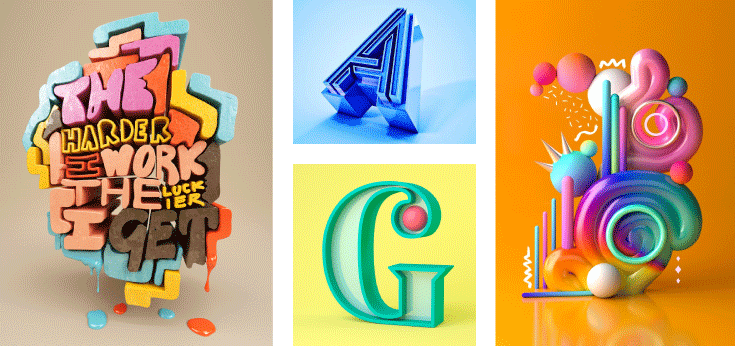
3D can be used to add depth to two-dimensional media. Combined with 2D elements or photography, it adds a touch of surrealism to a composition.
So where will this trend reveal itself? Here are a few places where you can expect to see 3D featured.
- Mascots: Previously 2D characters featured in logos and ads will now pop like never before.
- Shapes: Geometric shapes will make logos and ads more interesting.
- E-commerce and augmented reality (AR): 3D will allow augmented reality to become more mainstream and immerse customers in the buying experience. Shopify, Snapchat, Adidas, and L’Oreal have already started experimenting with AR experiences.
-
Typography: We’ve already touched on fonts, but you can expect to see bold design partnered with 3D technology to create typography that jumps off the page.
Authentic Photos
We will mention authenticity more than once in this blog and that’s because it’s worth talking about as much as possible. The generations coming into the market, who will soon have the most spending power, don’t want to be sold to - they crave authenticity. A posed stock photo that’s shown up on six other blogs in their feed, or has the same model they keep seeing everywhere, is not going to cut it.
But authentic stock photos are kind of an oxymoron...so, what’s the solve?
If you have the bandwidth to take your own photos, do it. Take a specific photo for a specific use. While this might seem like a lot of effort, here’s the thing...authentic means it can be natural and candid. Viewers have developed a penchant for photos that look like a semi-pro took them, not a professional.
This means you don’t have to set up a studio to take photos for your blogs...take photos of things that move you and they will probably move your audience, too. Get out your iPhone and snap pics of graffiti, cityscapes, nature, or interesting everyday details.
These are the things that tell a story.
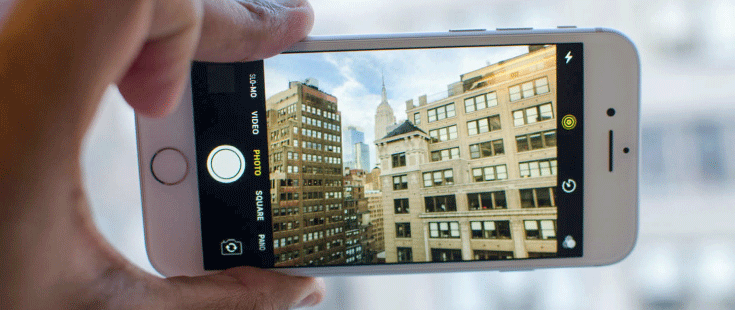
Learn a few tricks - made even easier as technology continues to evolve in the palm of your hand. Most smart phones now have the capability to mimic a DSLR (digital single-lens reflex) camera by creating a shallow depth of field effect (you know, where only one thing is in focus and the rest of the photo is blurry?). Teach yourself the rule of thirds and experiment with composing a few shots. Take a TON of photos – the beauty of digital is that you can take endless photos and only keep the ones that end up meeting your needs. The photos you take are yours and aren’t going to be showing up on your competitor’s blogs or social channels.
It’s also possible to find images like this on stock photo sites as they are becoming more and more popular. But be careful using this technique as your competitors are probably doing the same thing.
GIFS and Animation
No matter how you pronounce it (with a hard “g” or like the peanut butter) who doesn’t love a good GIF? But these fun, 20-second videos, are more than just a funny way to illustrate a face palm on your friend’s ridiculous Facebook post. This trend was growing back in 2018 and continues to gain popularity not just on social media and in texts, but also on websites.
 These videos can help your webpage, landing page, or even email tell a story that attracts the eye or just add some quirk to your page to keep visitors interacting longer. We can expect to see them on homepages, in social media, and in marketing materials. As smart apps that let you create GIFs in more manageable sizes than in the past hit the market, this trend will continue to grow. Be sure to use them in unique and engaging ways, not just to make a joke.
Classic Design Principles That Aren’t Going Anywhere
While design trends come and go, some “trends” made such an impression that they are here to stay. No matter what’s in style at the moment, you can’t go wrong with these classic design techniques.
Simplicity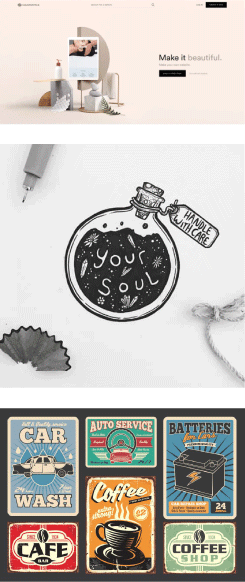
Who doesn’t love white space, right? Giving your audience room to breathe gives them the bandwidth to focus on your content. This “trend” comes and goes but it comes back so often that we think it’s worth mentioning as a classic design technique, especially when it comes to logos.
If a design uses simple elements, clear fonts, and is sleek and clean among chaos, it will stand out. Clean lines against white space, single colors, and no extra clutter are all features of simple design that will continue to be classic.
Hand-Drawn
Originality is always in style and hand-drawn designs are a great way to ensure originality in design. With the appearance of technologies like tablets with pencils that lend themselves to hand-drawn art, this trend is back, probably for good and deserves a spot among the classics.
Generic will never be ok, and hand drawn illustrations are the opposite of generic. They’re also extremely hard to copy so you never have to worry about anyone stealing your design.
Nostalgia
No matter what year it is, we always seem to yearn for years past, especially since the world seems to be getting more and more complicated.
Vintage and retro have been trending for years. This idea of using the past for inspiration isn’t going anywhere ... because the past always changes, right? Ten years ago we might have loved designs that imitated the funky technicolor and geometric shapes of the seventies, but today we might be pining for the neon colors and chunky fonts of the nineties--and yes, chunky fonts are “in.” No matter what year it is, the past tends to make us happy.
You can expect to see detailed vintage designs and mid-century styles pop up in designs across the internet. But, even though they mirror vintage design, they’ll have their own modern touch.
Authenticity
This is not a trend. We’ve talked about it once already and promised we would again.
There will always be new design trends that promise to be the next “classic” but if you’re constantly following the trends, you’ll lose sight of who you are as a brand. If you’re true to your brand, your value proposition, and the stories you want to tell, you will never be “out of style.” Don’t use a design because it’s on trend, use it because it speaks to you and you’re confident it will speak to your audience. This is the true definition of authenticity.
Whether you want to capitalize on the latest trends or stick to a classic design that will never go out of style, a professional can help you get ahead. Working with a graphic design professional to create your website, marketing materials, images, and social posts will help you not only stay on top of the latest trends, but also stand out in an internet full of mediocre design.
Topics: Brand, Branding, branding strategy, graphic design, logo, typography, trends


